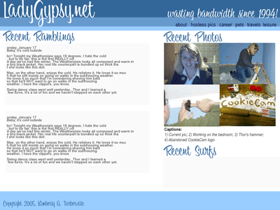
Mission: Redesign LadyGypsy.net
Objectives:
- Get away from the current ‘bajillions of boxes’ design. I was starting to feel claustrophobic.
- Fully exploit the font I bought last year.
- Try to design horizontally instead of vertically.
- Migrate to WordPress.
I’ve been trying to come up with a decent design for months. I came up with a LOT of different designs, but this one I crafted in PhotoShop in an hour or so. Blog (Recent Ramblings), photos (Recent Photos), and links (Recent Surfs) go on the home page. The other stuff will be linked to from the top. WeatherPixie (who received a stay of execution courtesy of Mom, who likes it) and various other blog y fall ‘below the fold’ as we newspaper people call it.
And I think the color bars are groovy. Again, I’ll attempt to do this layout mostly using CSS, but I may have to resort to a table for the photos.

Whaddya think, sirs?


