(A rant by Kim Russell)
I am not a designer by any stretch of the imagination; but I can spot bad design from a mile away. And as someone who has used a “bounce” font for her blog logo for over twenty year, I feel qualified to say: people need to stop bouncing their words.
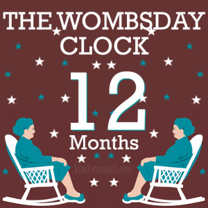
I created this in Canva, based on a decal I saw on a car at the grocery store.

The actual decal read: “I’d rather be in Stars Hollow,” which is a completely reasonable sentiment. I feel the same way, and I’ve never watched a single episode of Gilmore Girls. Honestly, having one awkward dinner a week to secure some of your rich family’s money for your child’s education doesn’t strike me as the worst thing in the world.
But the execution on the decal was so bad that I had to stare at it for a solid minute to be able to decipher it. The words were all different sizes, letters looped through each other, and the spacing was chaos.
If you care about something enough to stick it to your car, please make it legible.
Because Emily Gilmore would never.


