I originally planned for September’s cards to have a cozy back to school vibe. I already had a stamp set with various office objects: a desk, a typewriter, books, shelves, and so on. I stamped them all out (eight individual pieces per card), colored most with alcohol markers, and set the project aside until the next weekend.
When Saturday rolled around, I picked them back up and immediately hated everything I had done. The cards looked crowded, and the color schemes were just plain ugly.
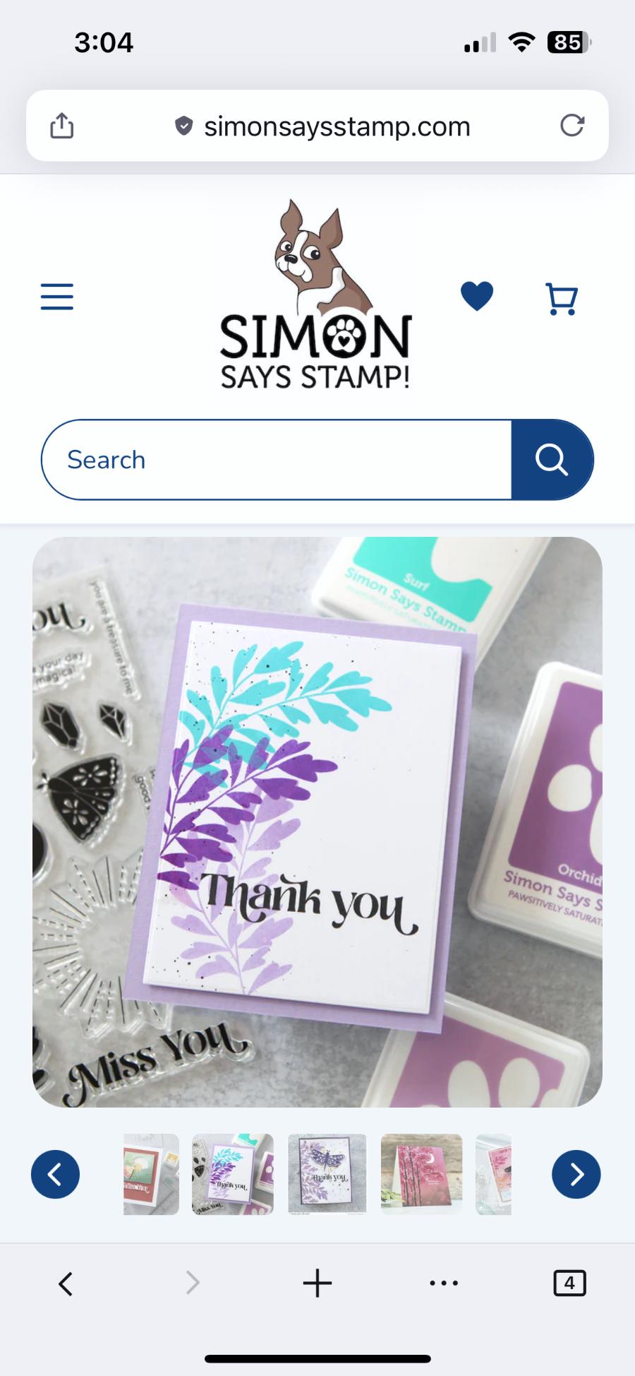
In a mild panic, I started tearing through my collection of stamps and once again picked up the Simon Says Stamp Celestial Wishes set that I always want to use but can never quite figure out how. I looked at their inspiration photos and saw this:
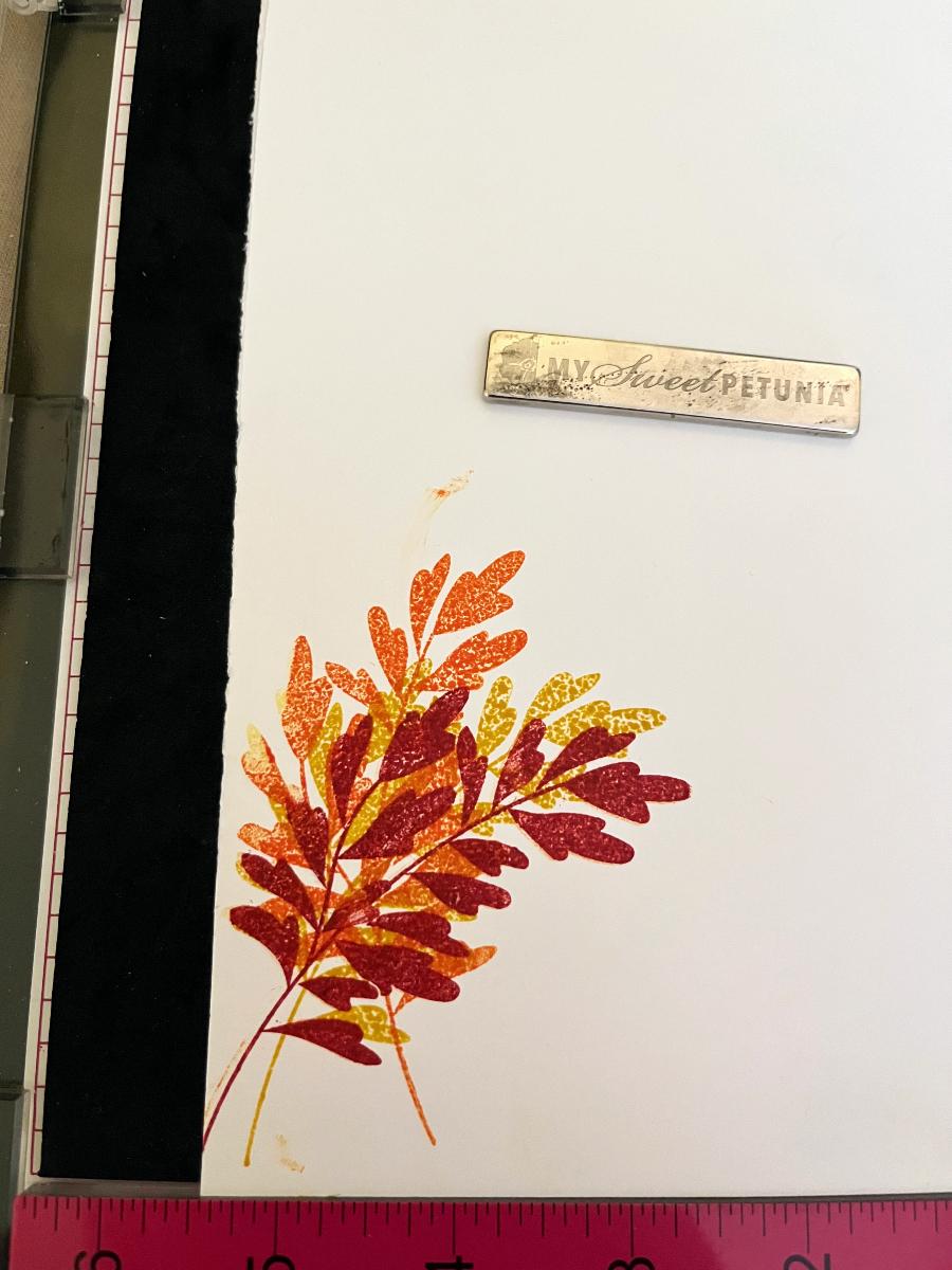
This looked lovely, but I never like to copy a card exactly. I prefer to put my own spin on it. Instead of using the cool purples in the example, I tried fall colors and stamped the branches on top of each other. Unfortunately, instead of looking warm and cozy, they looked like the flames of hell.
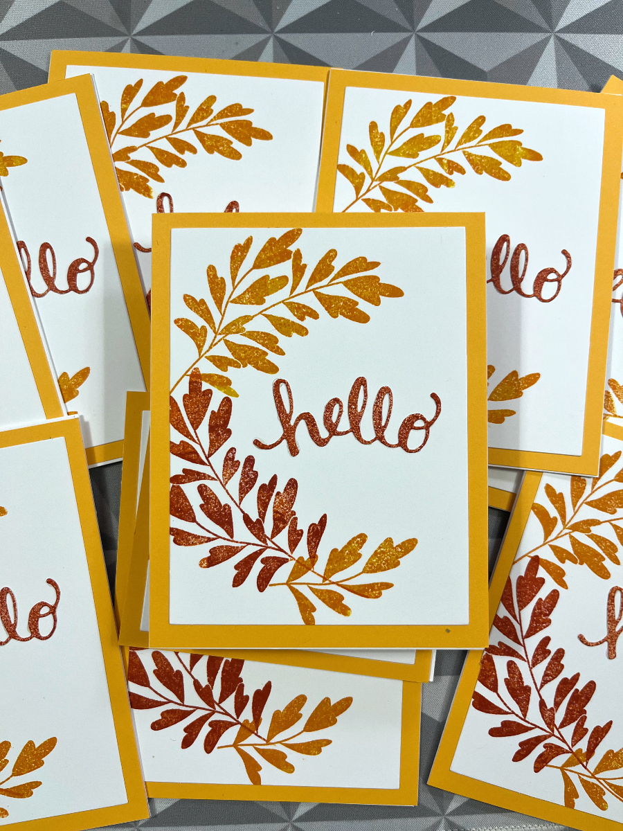
What I *did* like from the fiery branches was the way the colors layered together. That gave me the idea to turn the stacked branches into a half-wreath, with two colors per branch. The top and bottom branches got orange and yellow, while the center one used red and orange. Much better and very simple to pull off.
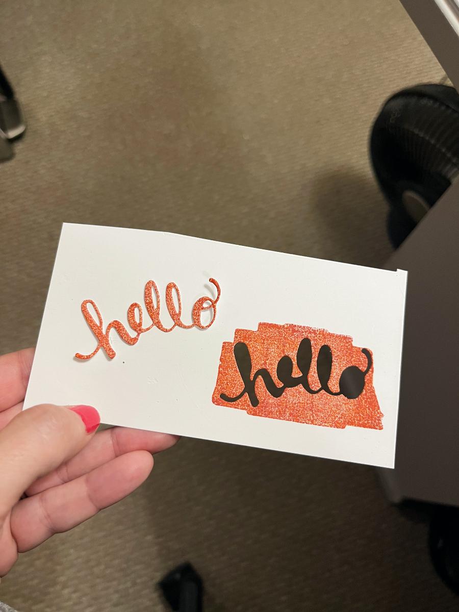
WM suggested I try the same layered color technique for the ‘hello’ cut out. To do that I flipped a clear stamp over and used the flat side to layer the inks directly on the cardstock before running it through the die cut machine. Later, I realized that stencil brushes might have worked too, although they probably wouldn’t have given me the same mottled effect.
Once I added the “hello”, I mounted the card panels to bright yellow cardstock (RIP, background for the Mug Life series), and finished them up.
In the end, these cards became a perfect example of snatching victory out of the jaws of defeat.