Rabbit rabbit! Happy September1! Another month gone means another set of cards here on the blog.
When I was looking for inspiration for my July cards, I pinned a design featuring a stamped bouquet of flowers with splashes of color behind them. What excited me most was realizing that I actually own that stamp set! I have plenty of cardmaking supplies, but definitely not as much as some crafters out there, so seeing something I already had felt like a small victory I was fully on the watermelon train back in July, but I knew — knew — that I’d be circling back to that flower card.
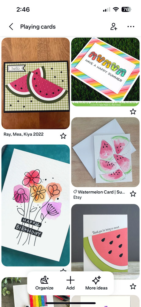
Here’s the wild part: that inspiration card was hand drawn by Kristina Werner (Instagram reels link). Hand drawn! And hand lettered! I assume that my stamp set was created from her original design.
Humbled but still motivated, I continued onward. My first step was to perform some testing: Kristina put the watercolor down first and then drew on top of it. Would it make a difference if I stamped first and watercolored behind it? Also, is my black ink waterproof enough for this? The answers were: it doesn’t matter, and yes!

When I painted over the stamped image, the color pulled away from the ink ever so slightly. The alternative, though, was painting first and trying to line up the stamp afterward. It wasn’t a risk I wanted to take. The tiny amount of white visible was a fair tradeoff for being able to confidently place the color. I also played with some paint splattering, which looked great with just two colors, but once I added more it became chaotic. I skipped it for this month, but I’ll revisit that technique later.
While I was inspired by the pinned card, I didn’t want to make an exact copy of it. Instead, I angled the bouquet from the lower left corner and stamp a single flower at the upper right. Simple, but it worked. I love it!
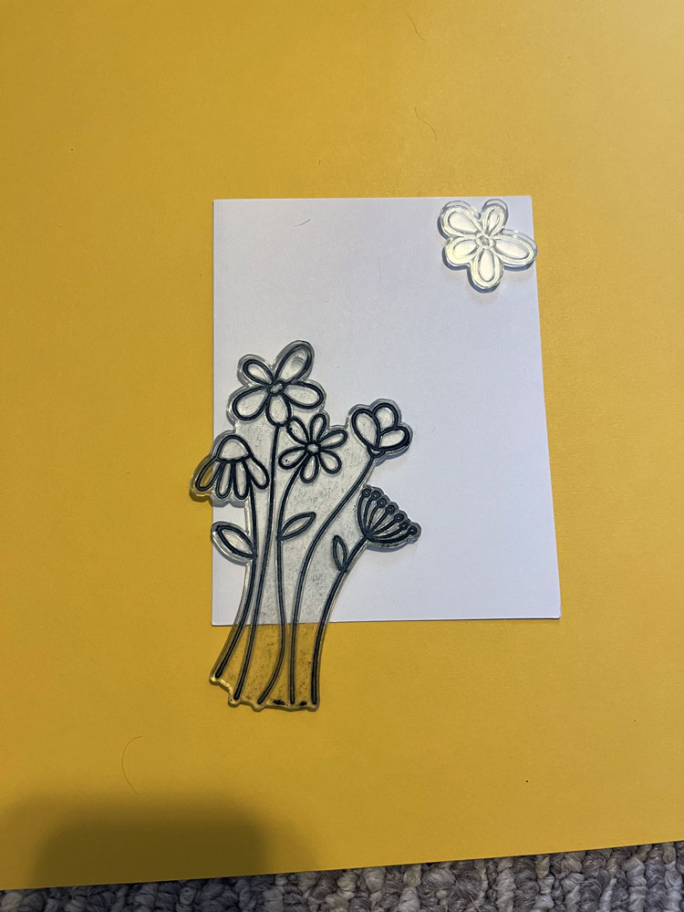
Once I stamped the 14 card fronts, I painted them color by color.
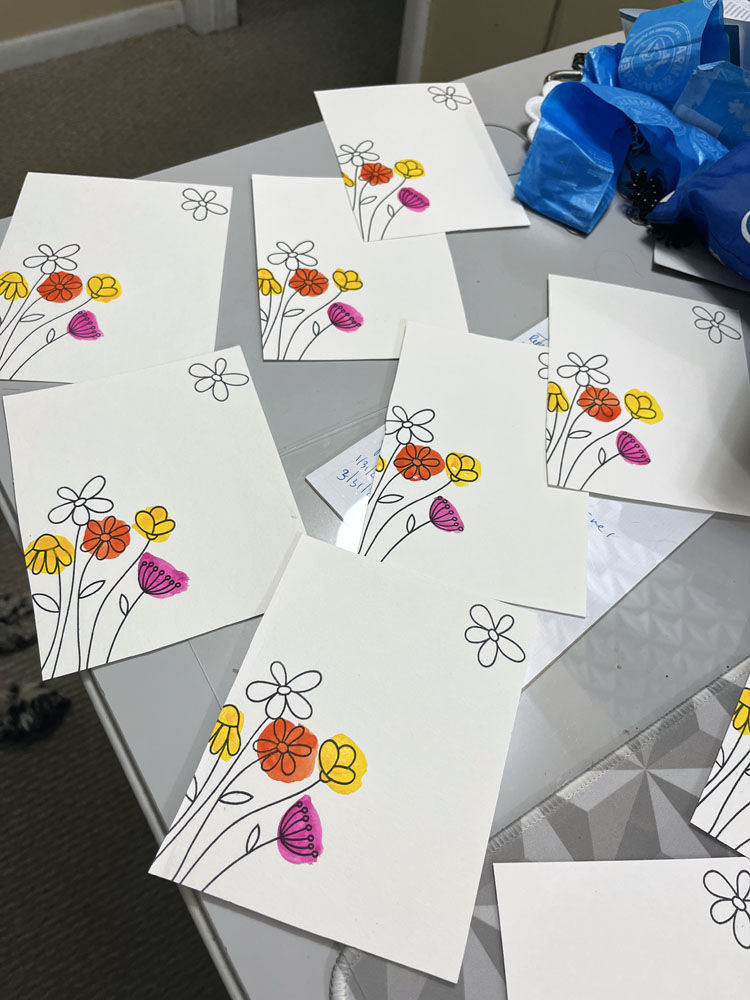
Next came cropping. I used a rectangle die to trim the card fronts down. Could I have used my paper cutter? Sure, but since but I already ruined one painted panel, I and didn’t want to risk losing any more. Dies always create a perfect rectangle. Me and my paper cutter? Not so much.
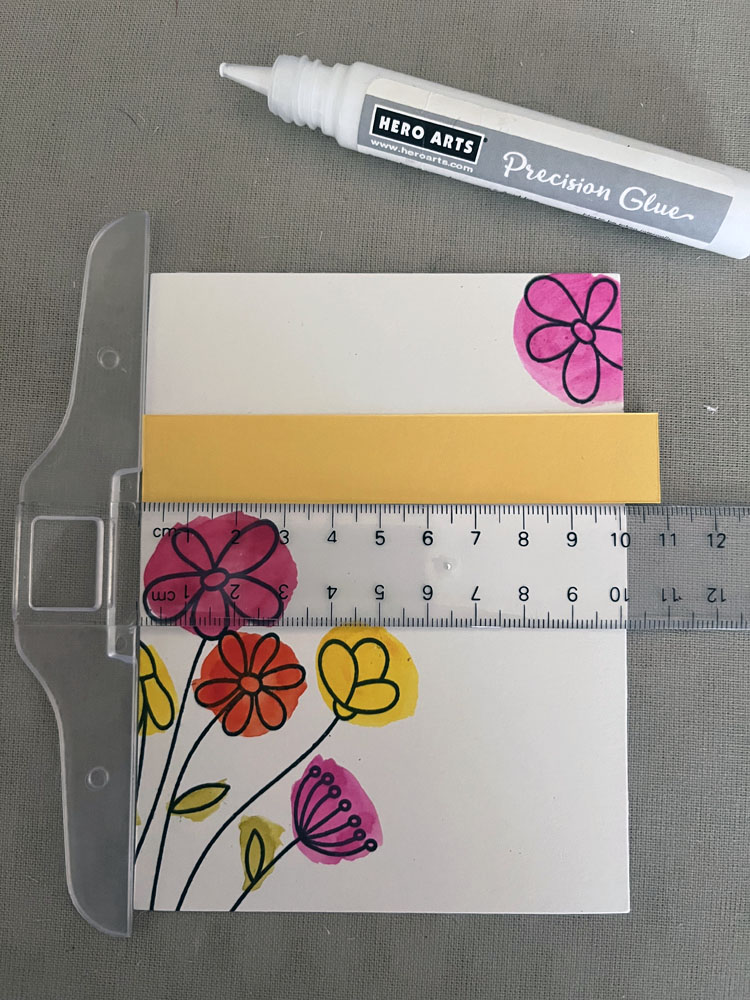
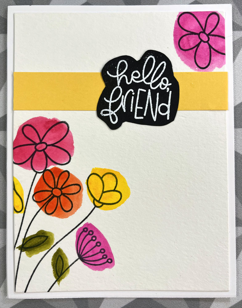
For the greeting, I corrected July’s regret of skipping white-on-black embossing. This time, I heat-embossed “Hello friend” in white on black cardstock, then cut around the it. But when I placed the greeting on the card front it looked unmoored, like it was floating awkwardly between the flowers. To create more of a connection to the rest of the card, I tucked a strip of yellow cardstock underneath. The yellow is close enough to the yellow paint I used behind the flowers that it all tied together.
Once everything was glued down, I had one of those rare (for me) crafting moments. I was happy.
I honestly think these are the best cards I’ve created. LOOK AT THEM!
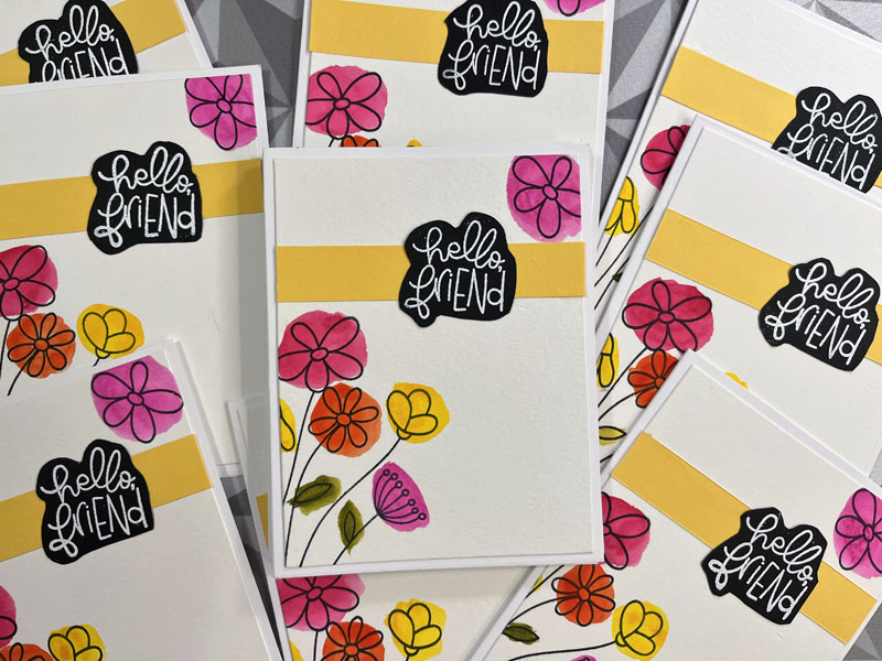
The design keeps the spirit of the original, but is different enough to feel like my own. These cards are beautiful an I am thrilled with how they turned out. Honestly, it’s all downhill from here. September’s cards are already underway and they feel like a hot mess in comparison. I’m too far in to turn back now.
Looking back at five years of car posts in this cardmaking category, I can see how much my design skills have grown. For a person who spends her nine-to-five in the (spread)sheets, I’m pretty proud of good ol’ Right Brain!
But as the saying goes, pride goes before fall. And September’s cards might be the tumble. Stay tuned!
- BOOOOO, hisss, blahhhh. ↩︎